Overview
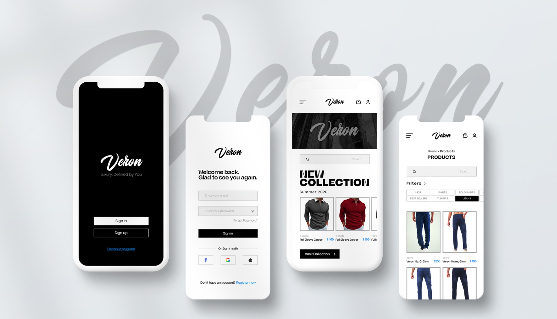
Veron is a premium men’s wear shopping app concept focused on fast discovery, clean hierarchy, and a confident brand feel. The goal was to design browsing and product discovery that stays elegant—even with filters, categories, and dense product lists.
My role: End-to-end product design (UX flow, UI system, high-fidelity screens, interaction states).
Timeline: 9–10 weeks
Platform: Mobile (iOS/Android)
Deliverables: Flow, UI kit, key screens
Tools: Figma
The problem
Men’s fashion shopping requires speed and confidence. Users need to scan product grids quickly, narrow options with filters, and trust the brand—without the interface feeling cluttered or “discount-like.”
Goals
- Fast browsing (clear hierarchy, clean grids)
- Low-friction filters and search
- Premium feel via typography and spacing
- Reusable components for scale
Process
1) UX flow
Onboarding → Home → Category → PLP → PDP → Cart.
2) Component system
Cards, chips, filters, headers, and states.
3) High-fidelity UI
Typography-driven hierarchy and spacing for readability.
Key screens

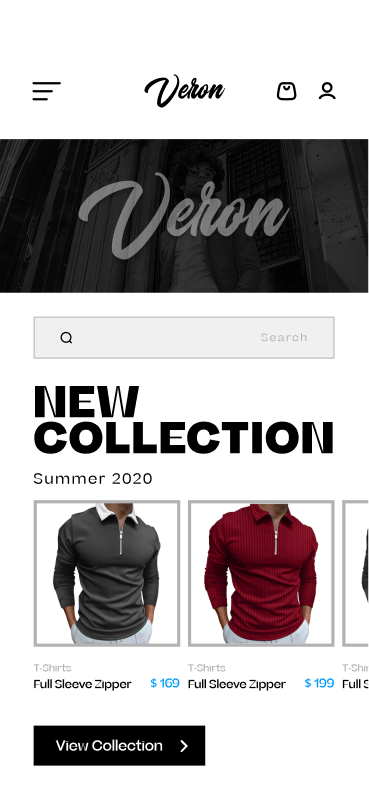
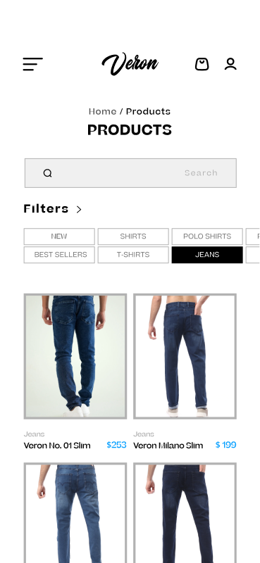
Key moments in the user journey, focusing on discovery, scanning, and product decision-making.
Outcome
A refined, conversion-friendly mobile shopping experience with clear discovery, consistent components, and a premium brand tone. The foundation is designed to scale into more categories, promotions, and personalization.