Overview
Tapli is a Watch & Earn rewards android/ios app where users earn points by watching short sponsored videos and completing simple offers — then redeem those points for airtime top-ups, data bundles, and services. The design focuses on clarity, trust, and a premium dark UI while keeping the earning loop fast and motivating.
My role: End-to-end product design (UX flows, information architecture, UI system, key screens, and interaction states).
Timeline: 6–7 weeks
Platform: Mobile (iOS/Android)
Deliverables: User flows, onboarding, key tabs (Home/Watch/Offers/Redeem), UI kit
Tools: Figma
The problem
Rewards apps often struggle with trust (Is this real? Will I get my reward?) and friction (too many steps before the user earns anything). Tapli needed a flow that feels reliable and premium, while making the earning and redemption journey obvious at a glance.
Users must instantly understand: how many points they have, what they can do right now, and what they can redeem.
Goals
- Make the core loop instantly clear: Watch → Earn → Redeem
- Increase motivation with a visible daily goal/progress
- Reduce friction: fast entry into available videos and offers
- Design a consistent, scalable system for rewards catalog and tabs
- Keep a premium dark UI with strong hierarchy and readable spacing
Process
1) Map the product loop
Onboarding → Home (balance + quick actions) → Watch (available videos) → Offers → Redeem (catalog).
2) Build the UI system
Dark cards, progress bars, CTA buttons, list rows, reward chips, and states (available / unavailable).
3) Polish + consistency
Typography hierarchy, spacing, and a clean accent gradient used on CTAs and key highlights.
Key screens
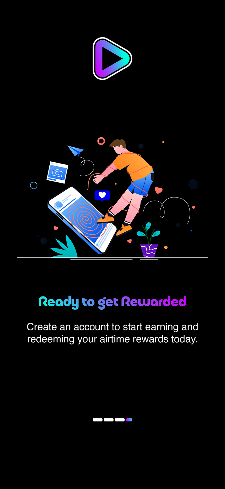
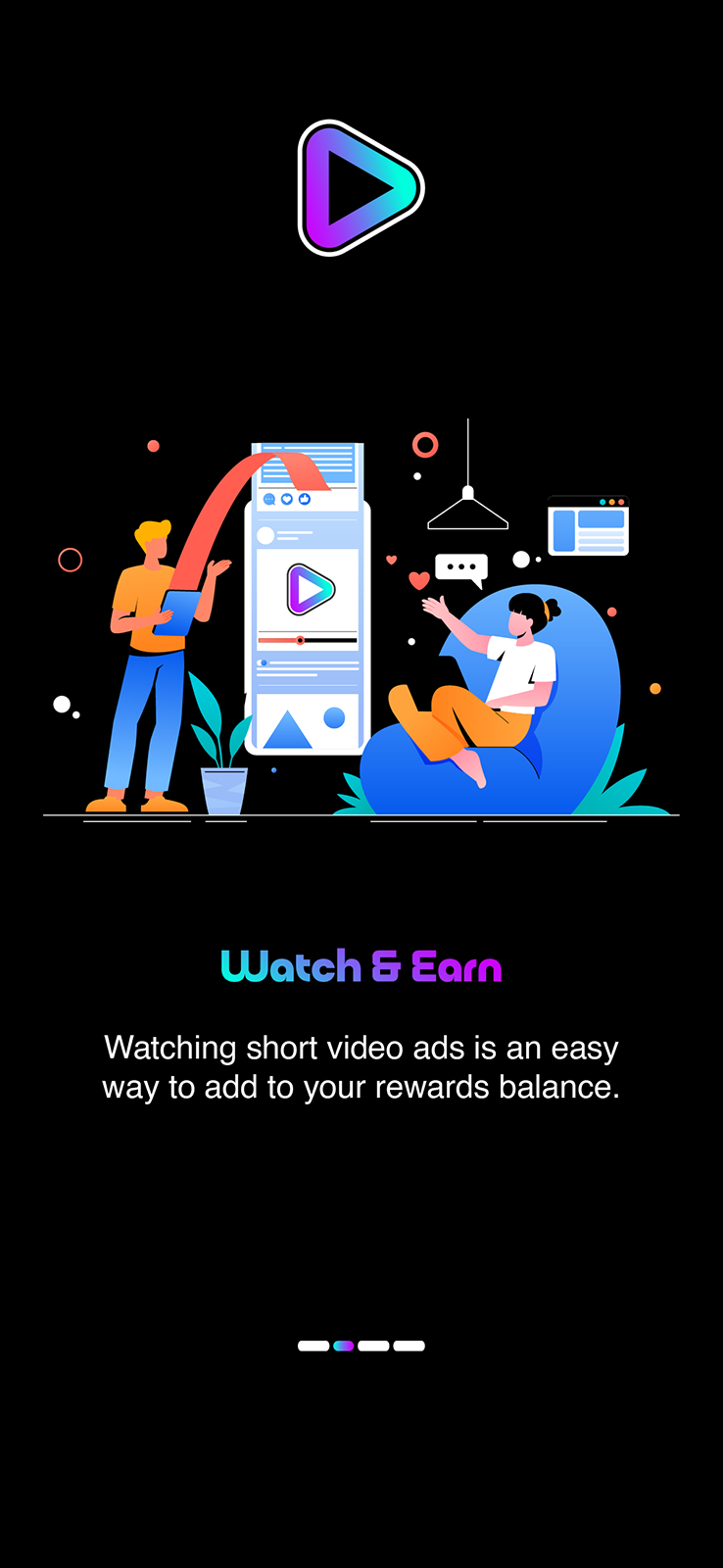
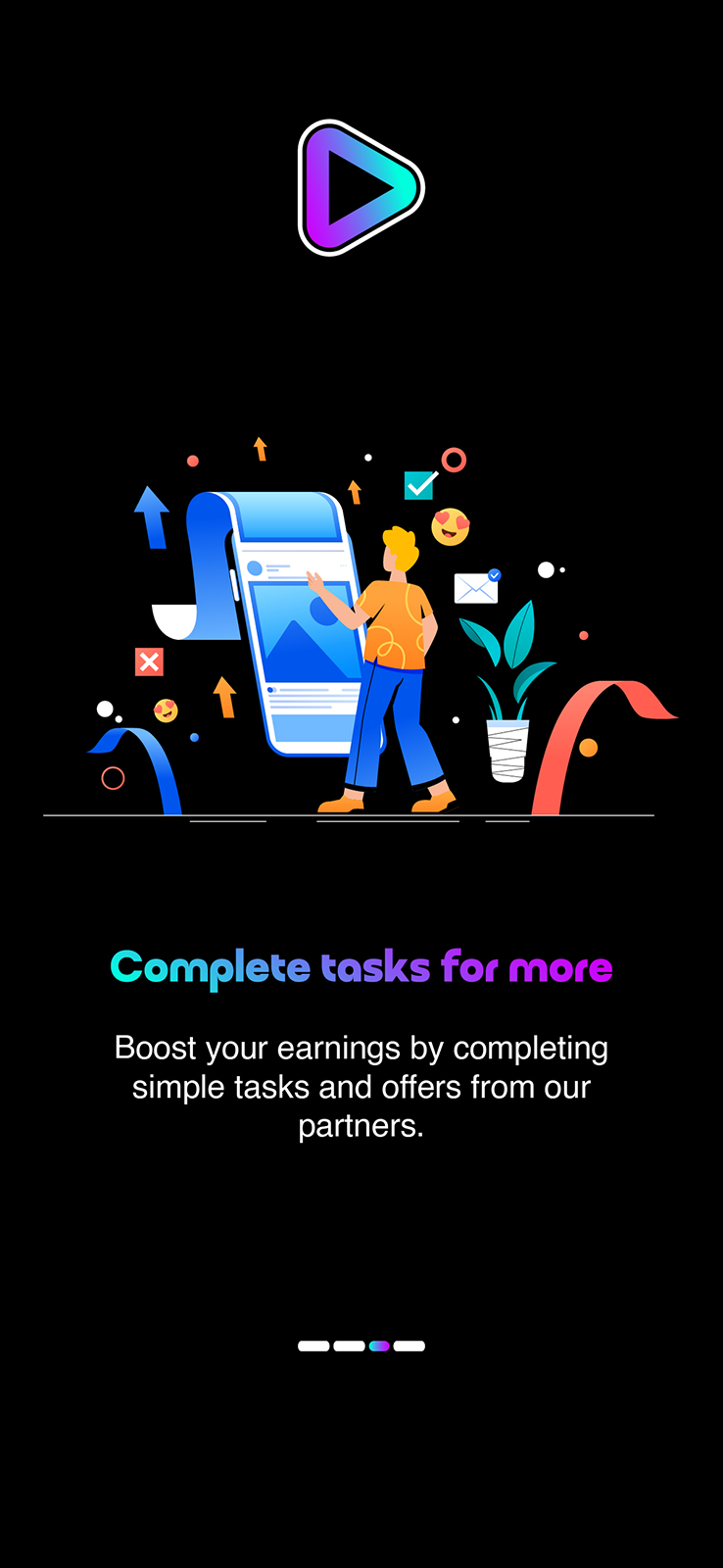
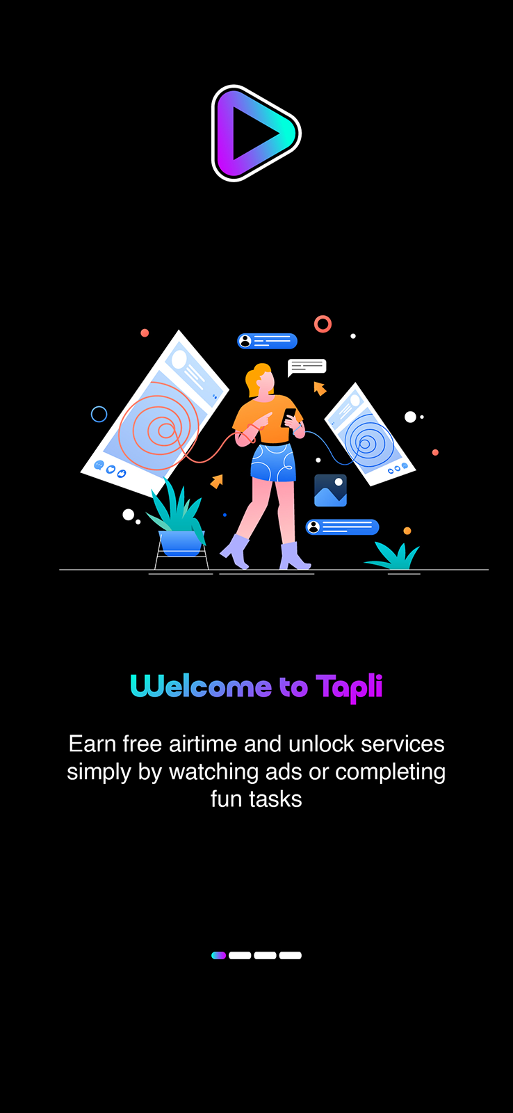
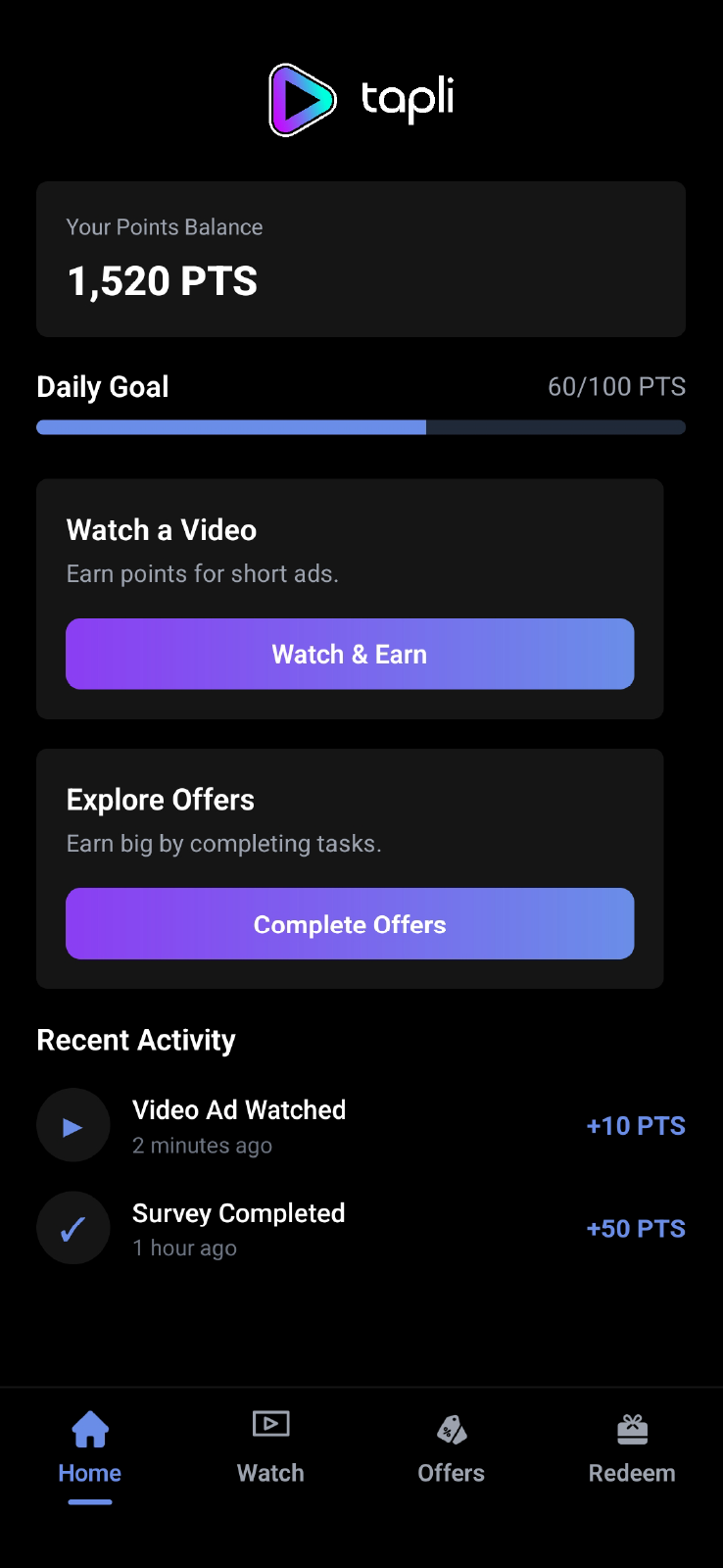
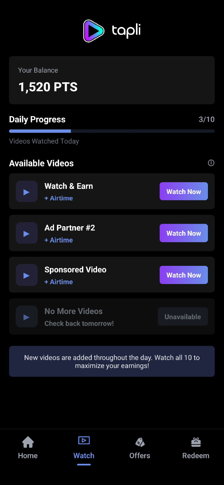
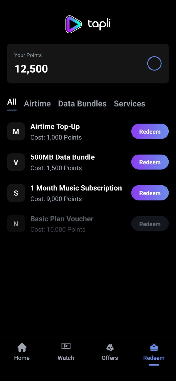
The UI emphasizes a clear points balance, a motivating daily progress indicator, and strong “Watch Now / Redeem” CTAs. Reward items use availability states (enabled/disabled) to set expectations and reduce frustration.
Outcome
A premium, conversion-friendly rewards experience that makes the value exchange obvious: watch short ads, earn points, redeem real utilities (airtime and data). The design system is ready to scale into more offer types, personalized recommendations, and expanded rewards categories.
What worked best
- Balance + progress placed at the top for instant clarity
- Simple tab structure: Home / Watch / Offers / Redeem
- Clear CTAs that match the user’s next step
Next iteration ideas
- Add “estimated earn” per video + streak rewards
- Redemption confirmation + delivery status (trust builder)
- Smart filtering and featured rewards based on balance


