Overview
Numbase needed a clearer corporate website that quickly explains what the company does, who it serves, and why partners should trust the team—without forcing users to hunt through dense pages.
My role: Information architecture, responsive page structure, UI layout, and content hierarchy (end-to-end for key pages).
Timeline: 3–4 weeks
Platform: Responsive Web
Deliverables: IA, page layouts, key sections, responsive structure
Tools: Figma
The problem
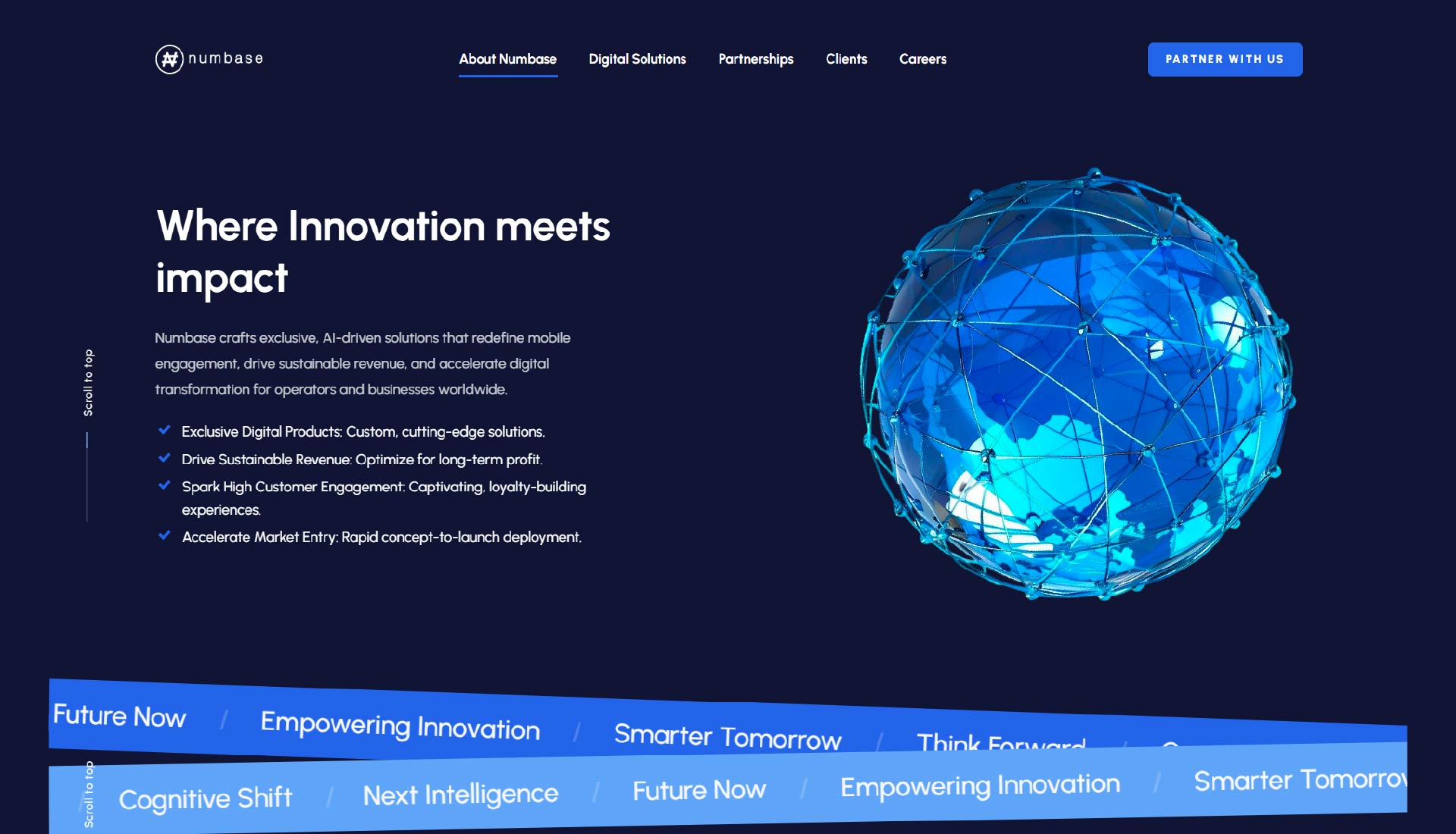
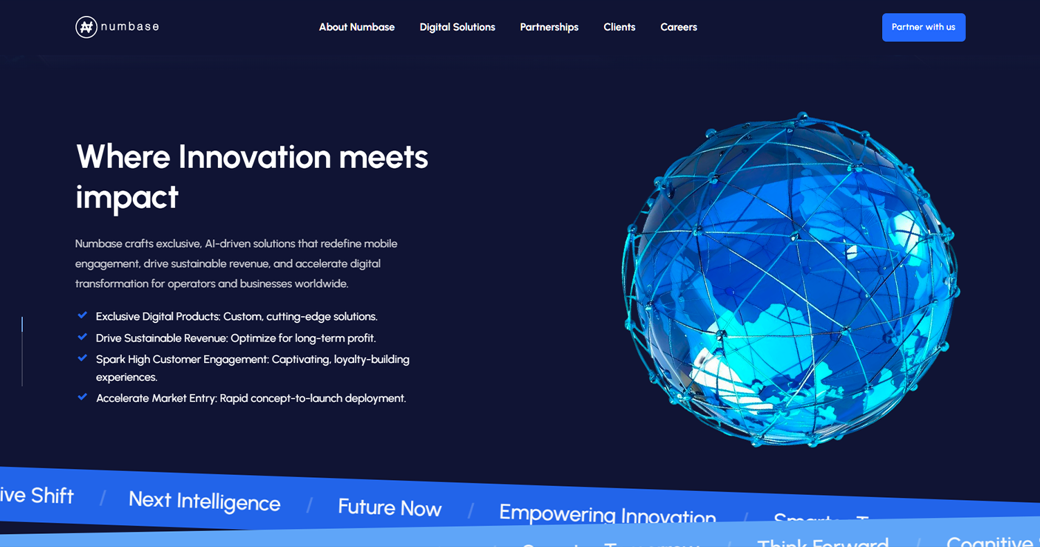
The previous structure buried the most important messaging. Visitors couldn’t quickly understand the value proposition, services, and differentiation in a single scan— which weakens trust and reduces inquiries.
Goals
- Clarify positioning in the first screen (who / what / why)
- Improve hierarchy so services are easy to scan
- Strengthen trust signals (partners, proof, process)
- Create a reusable layout system for future pages
Process
1) Restructure IA
Mapped page flow and grouped content into clear sections with a logical reading order.
2) Build hierarchy
Tightened typography, spacing, and section rhythm for fast scanning.
3) Convert with clarity
Added clear CTAs and trust cues to connect brand story → product outcomes.
Key screens
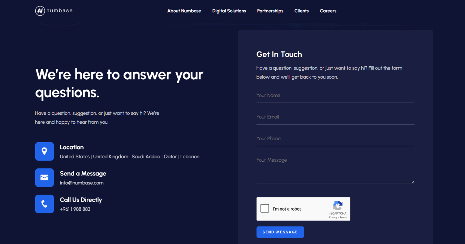
Swap the images with your exported screens (home, services, about, or any key conversion section).
Outcome
A sharper, more persuasive website experience that improves clarity for prospects and partners, supports a stronger brand-to-product narrative, and makes the offering easy to understand quickly.