
Overview
A mobile onboarding flow concept for Numbase × Mastercard focused on clarity, trust, and step-by-step guidance. The goal was to reduce drop-off in verification-heavy signup by making every step feel predictable and confident.
My role: UX flow design, UI design, microcopy (UX writing), and edge-case states (OTP resend, errors, recovery).
Timeline: 1–2 weeks
Platform: Mobile (iOS/Android)
Deliverables: Onboarding flow, UI screens, states
Tools: Figma
The problem
Multi-step onboarding often loses users—especially when verification feels confusing, slow, or uncertain. Users need to understand what’s happening, what comes next, and why the app needs it.
Goals
- Keep trust high through clear labels + guidance
- Make step progression obvious (users always know “where am I?”)
- Reduce friction with clean inputs and smart defaults
- Cover edge cases (OTP resend, incorrect codes, recovery states)
Process
1) Define steps
Mapped the shortest, clearest path: phone → OTP → confirmation.
2) Write for trust
Added friendly UX copy that explains why verification matters.
3) Design states
Handled resend, validation, errors, loading, and recovery patterns.
Key screens
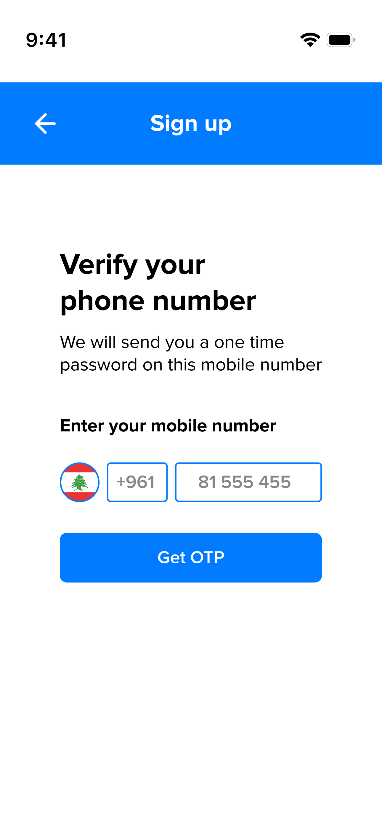
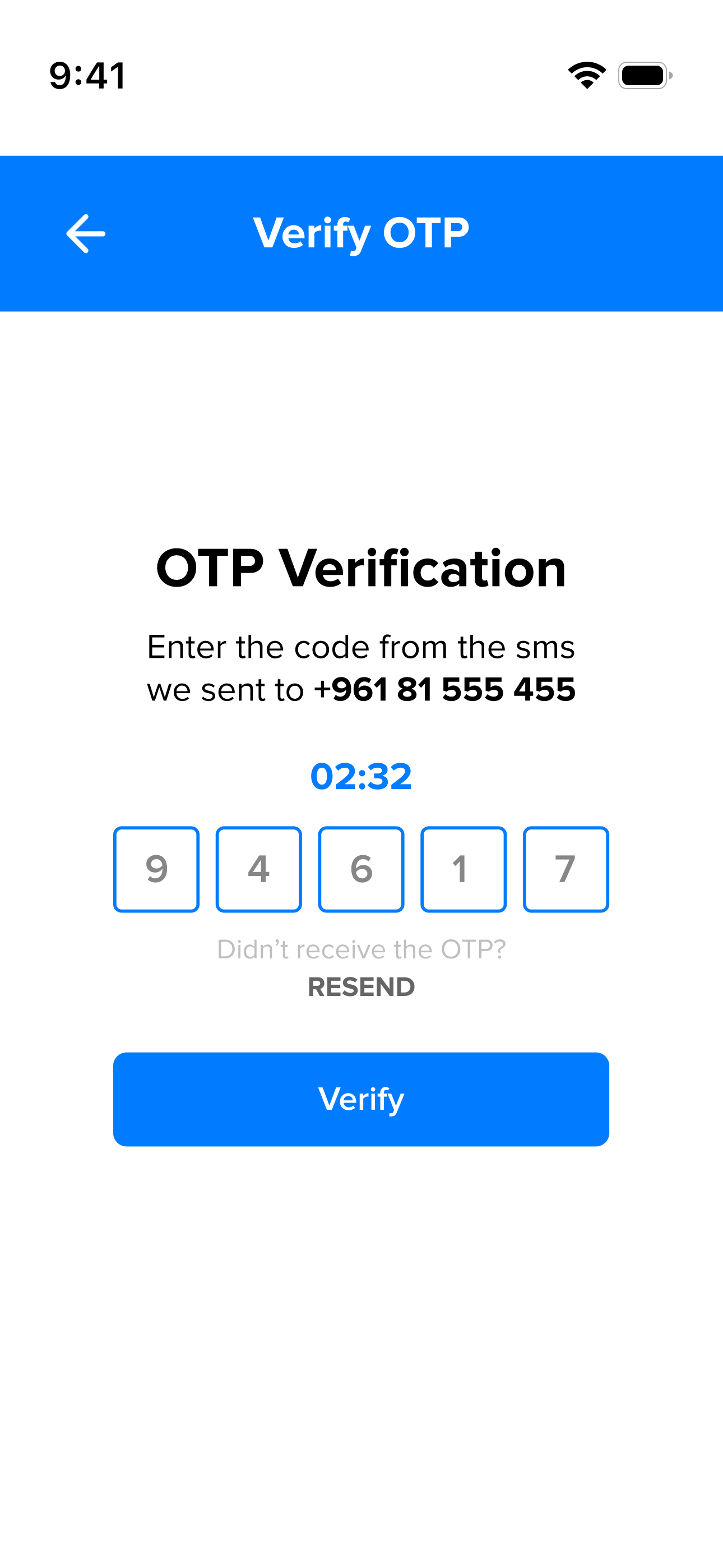
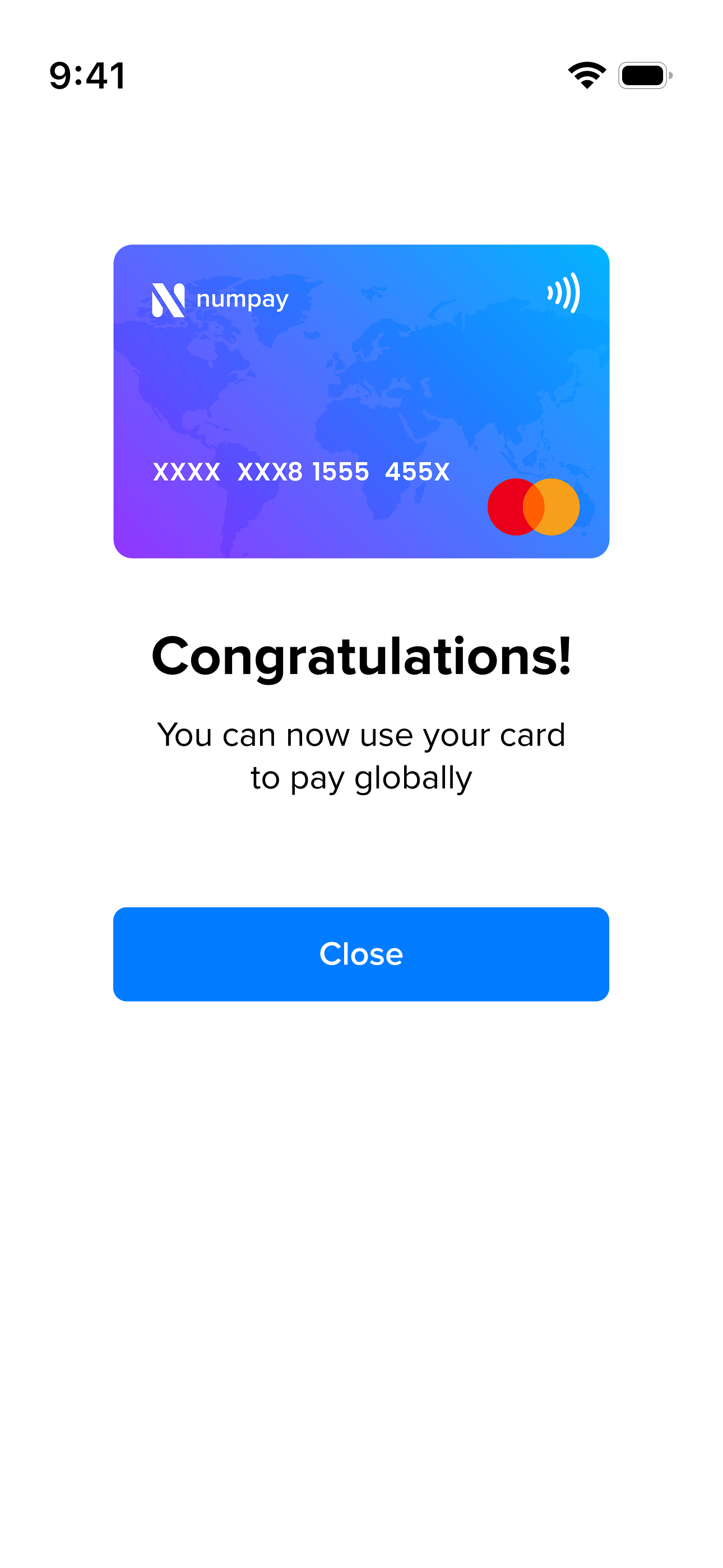
Key moments in the journey: phone entry, OTP verification, and confirmation—optimized for clarity and confidence.
Outcome
A clean, confidence-building onboarding experience that reduces friction and makes compliance-heavy steps feel simple, guided, and predictable.