
Overview
KODEQ is a modern brand identity system built for a marketing product team. The goal was to create a cohesive wordmark and practical rules that stay consistent across product UI, marketing assets, and launch materials.
My role: Brand identity design (wordmark, spacing rules, color + type system, usage guidelines, and rollout examples).
Timeline: 7–8 days
Deliverables: Logo kit + mini guidelines
Formats: SVG, PNG, PDF
Tools: Illustrator / Figma
The challenge
Without a defined system, teams improvise. That leads to inconsistent logo usage, mismatched typography, and visuals that feel stitched together across channels—especially during launches.
Brand goals
- Look modern, confident, and “launch-ready”
- Work across UI + marketing without re-styling
- Stay readable at small sizes (favicons, headers, app UI)
- Create simple rules the team can follow fast
Logo system
Primary wordmark

Used for headers, hero sections, and marketing assets.
Inverse / light background

Used on white cards, docs, and UI surfaces.
Clear space + sizing rule
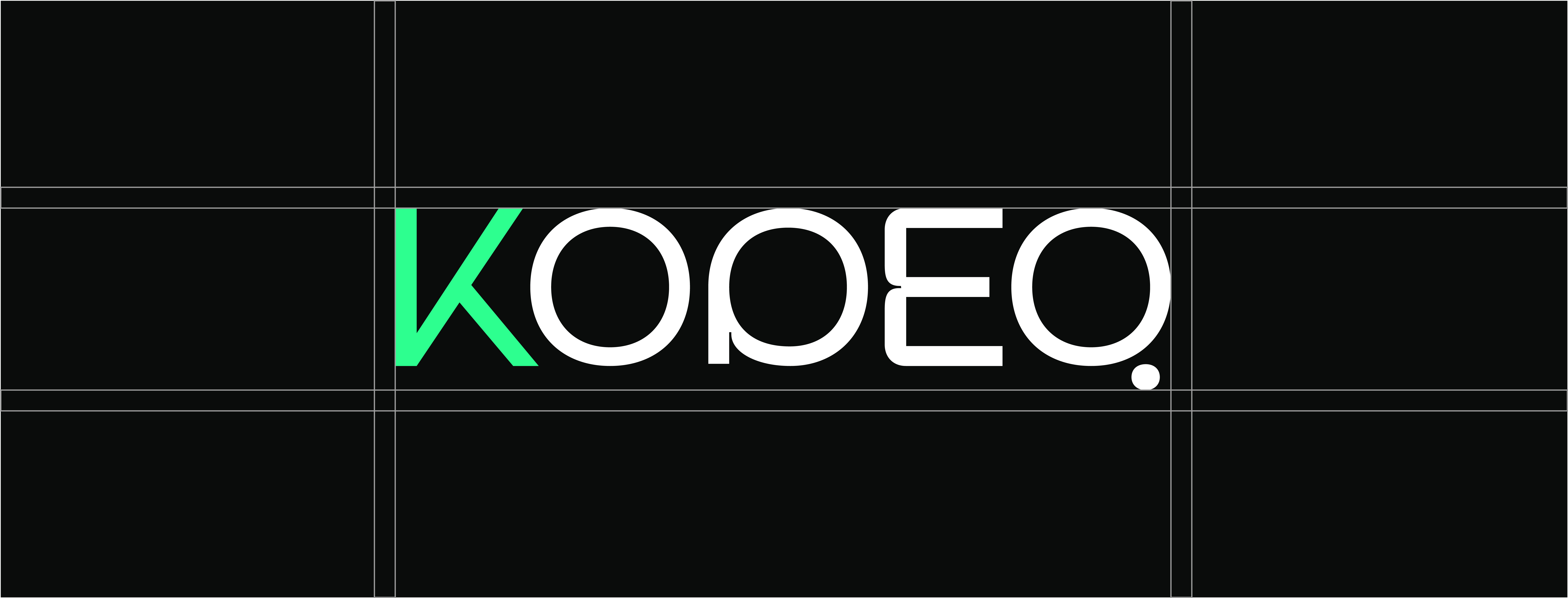
Clear space is defined by the height of the “K” stroke. Keep at least 1× clear space on all sides. Minimum size: 24px height for digital UI.
Color palette
#2DFF8F
#0A0C0b
#FFFFFF
Typography
Manrope font family
Readable at small sizes, consistent across product screens.
Type usage rules
- Headlines: 700 weight, tight spacing, short lines
- Body: 400–500 weight, comfortable line-height
- Avoid mixing multiple font families (1 is the system)
Do’s & Don’ts
Do
- Keep clear space around the wordmark
- Use the approved colors only
- Place logo on high-contrast backgrounds
- Use SVG for crisp scaling
Don’t
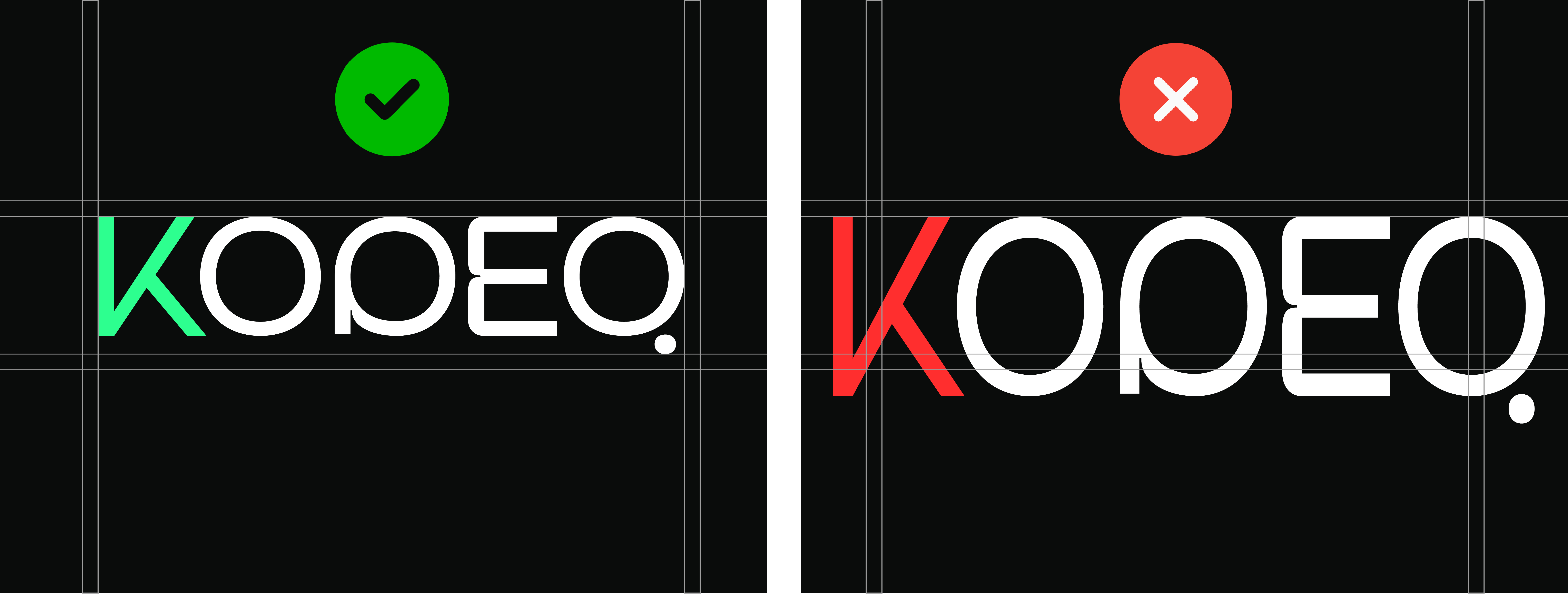
- Stretch or skew the logo
- Change the logo colors randomly
- Add shadows, outlines, or effects
- Place on busy backgrounds without a solid overlay
Examples
Replace with your actual “correct vs incorrect” exports.
Applications
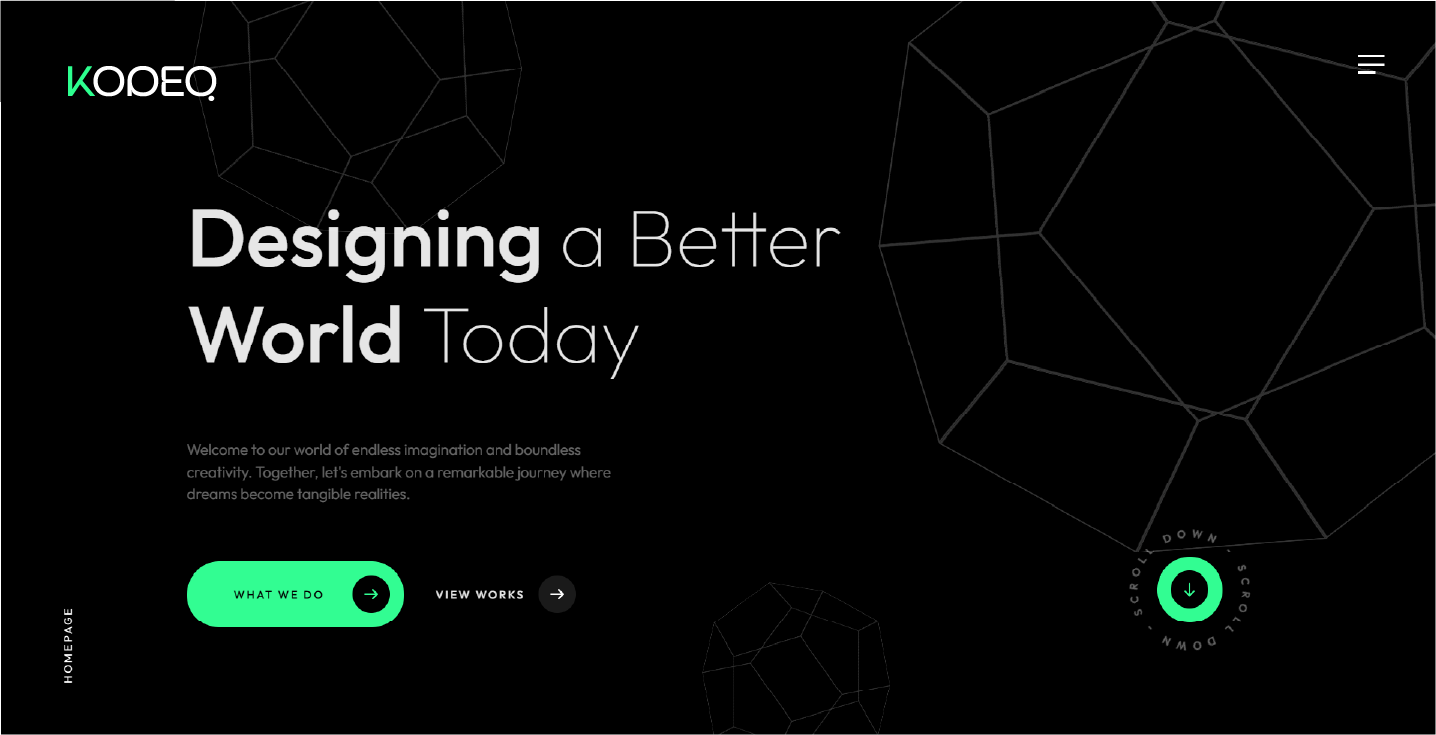
Kodeq - Website

Kodeq - Website 2
Deliverables
- Primary + inverse wordmark (SVG + PNG)
- Spacing and usage rules
- Color + typography guidance
- Mini brand guideline PDF (internal-ready)


