Overview
DS2 needed a logo enhancement that improves legibility and consistency across digital and print touchpoints—especially at small sizes. The focus was to refine (not reinvent) the identity so it feels more confident, modern, and easier to use across UI, documents, and marketing.
My role: Logo refinement, geometry cleanup, spacing rules, and usage guidelines (clear space, sizing, contrast).
Timeline: 4–5 days
Scope: Logo enhancement + mini guidelines
Deliverables: Old vs new, spacing rules, color use, exports
Tools: Illustrator (vector), Figma (presentation)
Before & after
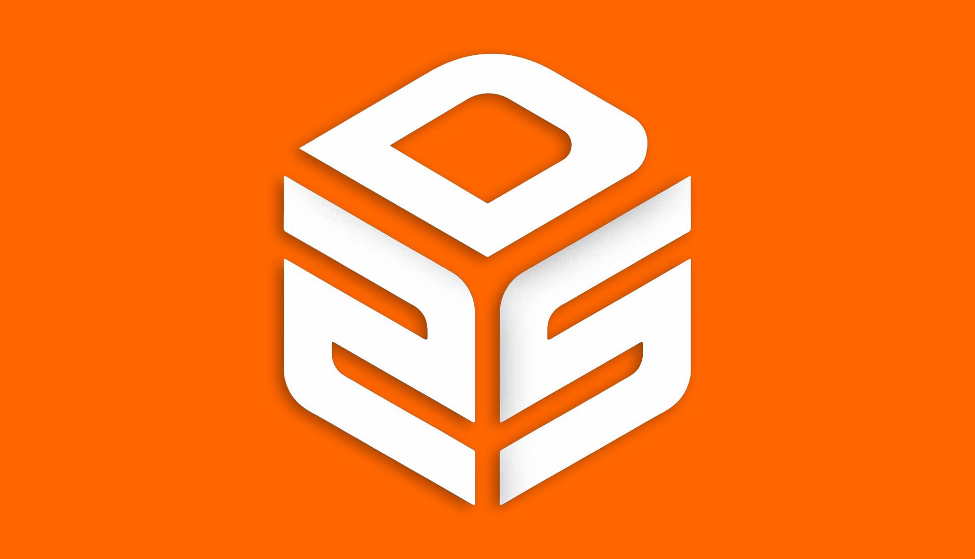
Old logo
Before
Enhanced logo
After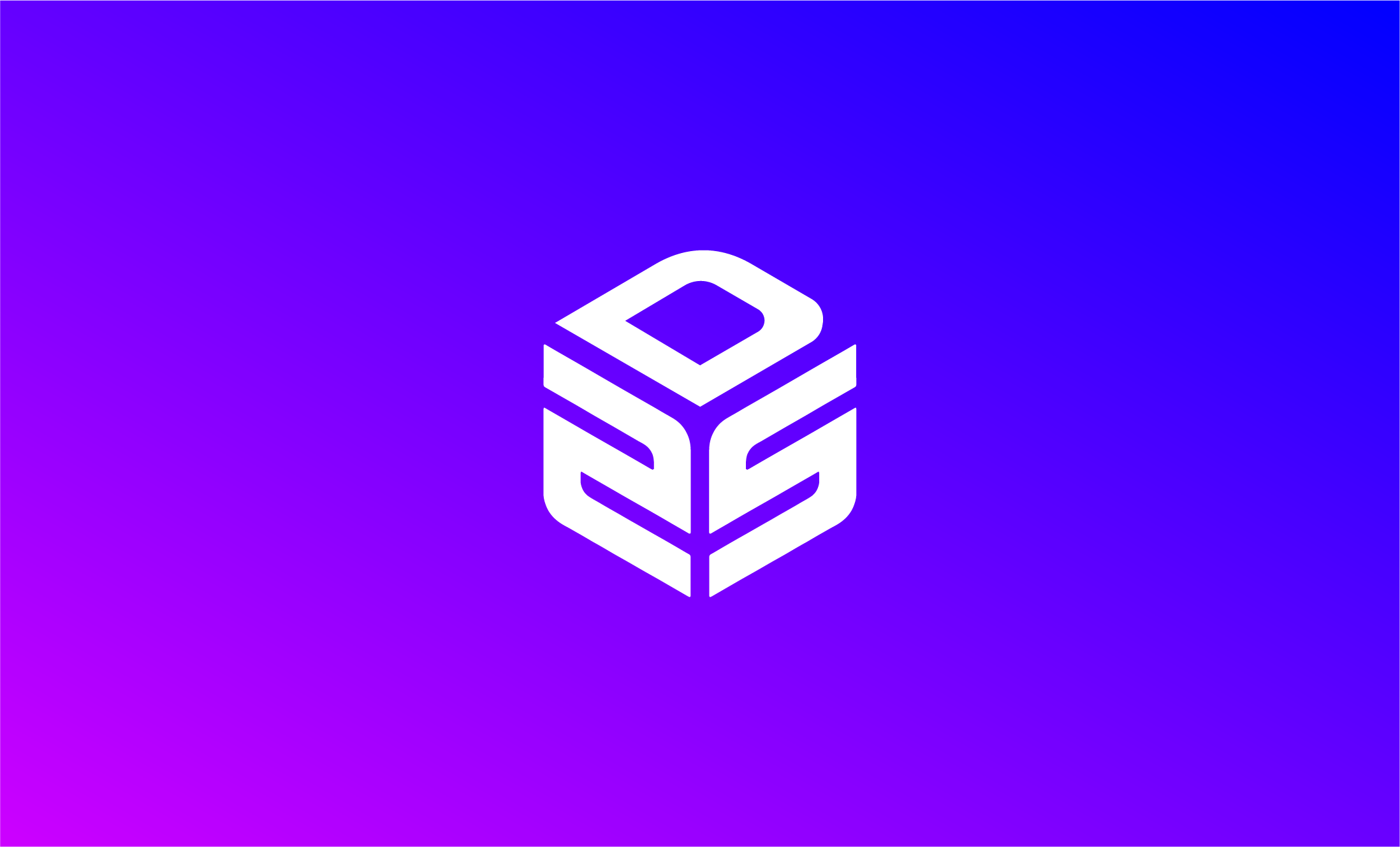
The problem
The previous logo became hard to reproduce consistently: small-size legibility dropped, spacing felt inconsistent across placements, and the mark didn’t scale cleanly in UI headers, icons, and documents.
Goals
- Improve legibility at small sizes
- Refine geometry for a cleaner, more modern feel
- Define clear space + minimum size rules
- Create consistent exports for real-world usage
What changed
1) Proportions & spacing
Adjusted internal spacing and alignment so the logo sits consistently in headers, lockups, and UI.
2) Geometry cleanup
Simplified shapes and refined curves for clearer readability and smoother scaling.
3) Usage rules
Defined clear space, minimum size, and contrast rules so teams don’t improvise and break consistency.
Mini guidelines
Clear space
Use 1× the logo’s internal stroke height as minimum padding on all sides. This prevents cramped placements in UI and print layouts.
Minimum size & contrast
- Digital: minimum height 24px (logo lockups)
- Icon use: use simplified mark if below 20px
- Contrast: avoid low-contrast backgrounds
- Spacing: never squeeze horizontally
Outcome
A cleaner, more scalable DS2 identity that stays readable in small UI placements, prints consistently, and looks confident across touchpoints. The mini-guideline rules reduce improvisation and help teams ship faster with fewer inconsistencies.
What I’d improve next
- Extend guidelines into a 1–2 page quick brand sheet (color + typography + usage)
- Create icon/monogram variant for tiny placements (favicons, app icons)
- Build ready-to-use templates (social header, pitch slide, email signature)